Daymark: A Calm Planner for Flexible Planners
A local-first daily planner where folders hold the work, any step can be pulled into today, and each day leaves a hand-drawn mark of what got done.
2026-09-22
A local-first daily planner where folders hold the work, any step can be pulled into today, and each day leaves a hand-drawn mark of what got done.
🗓 Personal project · in daily use on my iPhone and Mac since September 2026
🧠 Problem
Most planners are built for one of two people.
- Strict planners get time-blocked calendars and rigid schedules.
- Spontaneous people get a plain to-do list that turns into an endless backlog.
I'm neither. I like having a plan, but I rearrange it all day. My tasks lived in three places: a to-do app for today, notes for ongoing projects, and a calendar for fixed events. None of them showed whether a day had actually gone well.
Two things kept going wrong:
- Projects with several steps didn't fit into a daily list, so they stayed in notes and got forgotten.
- Every to-do app I tried counted what I hadn't done: red badges, overdue counts, broken streaks. On a busy week, opening the app felt like being graded.
💡 Insight
The planner I wanted had to do three things:
- Hold work somewhere that isn't today. Folders for multi-day work, whether or not it has a deadline.
- Make moving things free. Pull a step into today, push it to tomorrow, or send it back to its folder without anything breaking.
- Remember what got done, not what was missed. A visible record of each day that grows as you check things off.
Plan loosely, move freely, and keep a calm record of what you actually did.
🚀 Solution
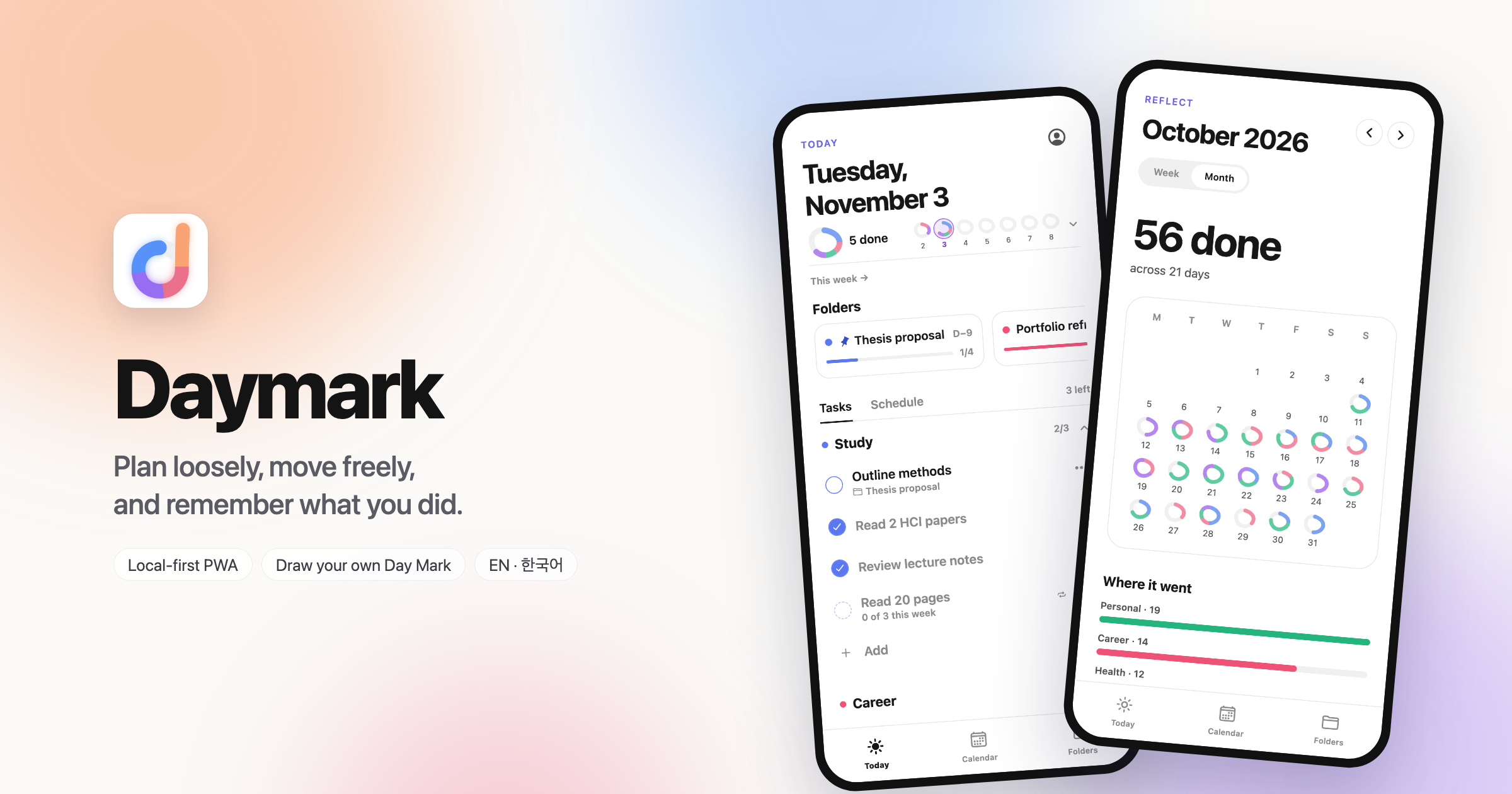
Daymark joins a daily task list, folders, a read-only calendar and a completion history in one calm app.
- Today: tasks grouped by color-coded lists, with today's calendar events alongside.
- Folders: multi-day work with optional deadlines. Any step can be pulled into today, and it stays the same task, not a copy.
- Day Mark: a mark that fills in list colors as tasks are completed. Each user draws their own shape.
- Reflect: a week and month view that only adds up what got done.
✨ Key Features
✍️ Draw-your-own Day Mark
- New users draw a mark on the first screen: a circle, a heart, initials, anything, in as many strokes as they like.
- As tasks get done, the drawing fills stroke by stroke, in the order it was drawn, segmented by list color.
- Work finished on a later day shows as a lighter band, so a day's record stays honest without being negative.
- The same mark appears small in the calendar, so a month of marks shows how the month went at a glance.
📁 Folders that feed Today
- Folders hold work that spans days. Deadlines are optional, with countdowns when set.
- Tapping a folder pulls its next step into today. Dragging a task onto a folder sends it back.
- Pinned folders, manual ordering, archive and restore.
🔁 Moving work without losing the record
- Move a task to tomorrow, to a chosen date, back to its folder, or off the day entirely.
- Moving a task off a past day leaves a quiet "moved to Oct 7" trace, so earlier days keep their history.
- Routines appear as faint "ghost" rows until added: every day, on chosen weekdays, or N times a week.
📊 Reflect: only what you did
- The week's marks, a month grid, "17 done · across 7 days", effort per list, folders finished, and the fullest day.
- No percentages, no "missed", no comparisons with last week, no streaks. Days with nothing done stay blank.
🗓 Calendar view and import
- Google, iCloud and Outlook calendars connect through private iCal links.
- Events are read-only and never become tasks automatically. "Add to today" turns one into a task on purpose.
⌨️ Small things that make it daily-usable
- Quick add with
N: "Send thesis outline tomorrow #study @thesis" is filed as a step in that folder, on tomorrow, in that list. - Full English and Korean UI, with Korean copy written rather than machine-translated. Light and dark themes.
- Installable PWA on iPhone, Mac and Windows; works offline; backup export and import plus CSV export.
🏗 Architecture
Expo + React Native Web (TypeScript strict)
↓
Zustand store, persisted locally (AsyncStorage / localStorage)
↓
Sync engine: dirty queue · server-cursor pull · newest edit wins · tombstones
↓
Supabase Postgres (one daymark_items table, row-level security)
↓
Supabase Edge Function (Deno + ical.js) → read-only iCal feeds
↓
GitHub Actions → GitHub Pages (PWA with service worker)
- Local-first: the app works fully signed out and offline. An account only adds sync across devices.
- One selector for the Day Mark: completion is computed only from
completedAt, in a single selector. Every surface (Today, calendar, Reflect) draws from the same numbers. - Document-style sync table: every item is one JSON row keyed by
(user, kind, id). The schema changed many times while I used the app daily; new fields never needed a server migration, and older clients never broke.
🧠 Key Decisions & Tradeoffs
- Removed time-blocking after building it. A drag-to-reserve-time rail on Today worked, but it made the app feel like a scheduler. I parked it, and Calendar became view + import only.
- "Projects with deadlines" became "Folders". Real work often has no deadline. Making deadlines optional and renaming the concept fit how I actually planned.
- Never show what was missed. Overdue counts and streaks were kept out on purpose. Moving a task off a day leaves a quiet trace instead of a red badge.
- Drag-and-drop only where it earns its place: reordering and moving tasks within Today, dropping a task on a folder, and reordering folders. Nowhere else.
- Local-first over server-first. This added a sync engine to build, but it means the app opens instantly, works offline, and never requires an account.
- Kept it a web app. I planned an App Store launch (accounts, notifications, widgets), then chose to keep using the installable web app and park the native work.
🎨 Design Process
- App icon: 13 rounds of generated studies, from abstract rings (top) to a lowercase "d" built from the Day Mark itself, ending with a peach → rose → lavender → sky gradient (bottom right).
- Day Mark: went through five treatments (watercolor wash, ribbon, glass tube, doodle, and a classic ring) before doodle became the default and the drawn mark shipped as Custom.
- Layout: spacious task screens and dense calendar screens; a two-column desktop layout and a compact phone layout with a Tasks | Schedule pager.
⚙️ How I Built It
I built Daymark solo, working with AI coding agents in Claude Code. I planned and reviewed with Claude Opus, and delegated implementation to Claude Sonnet with written specs.
My role:
- Product direction, every product and design decision, and daily dogfooding
- Writing specs and reviewing every change: type checks, web builds, and screenshots at phone and desktop sizes before each deploy
- Keeping the docs as the source of truth: a PRD, design guide, architecture notes, and a decision log of 70+ entries
The result was 75 small, verified commits in about six weeks, with each working state auto-deployed to GitHub Pages.
🔗 Links
🧭 Reflection
Building something I use every day changed how I judged features. The questions stopped being "is this impressive?" and became "did this make today easier?" and "does opening the app feel good?"
Some of the best decisions were removals: time-blocking, mandatory deadlines, overdue counters. Daymark got calmer each time something left.